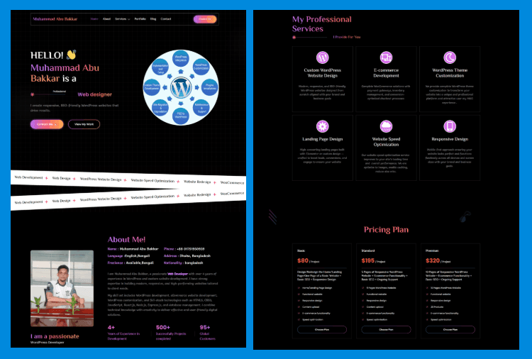
Muhammad Abu Bakkar Personal Portfolio Website Using Elementor | WordPress 2025
Create a stunning and professional portfolio website that highlights your skills, experience, and projects in the best possible way. A modern portfolio helps you build trust, attract clients, and showcase your personal brand online. Fully responsive, fast-loading, and SEO-friendly design ensures a smooth experience on all devices while giving your work a clean and impressive presentation for visitors and potential customers.
Gradient Heading Text
<span class="text-bg font-shadow">Esther Joy</span> is a
Hide horizontal overflow for the entire page CSS
<style>
/* Hide horizontal overflow for the entire page */
html, body {
   overflow-x: hidden;
}
</style>
Text with a gradient background CSS
.text-bg, .tabs .e-n-tab-title[aria-selected=true] {
   background: linear-gradient(to right, #BB6FFB 0%, #FC5F67 52%, #FFB054 100%) !important;
   -webkit-background-clip: text !important;
   -webkit-text-fill-color: transparent !important;
}
Text with a gradient background CSS Class
text-bg
Text with a subtle shadow effect CSS
.font-shadow {
    font-family: "Anek Bangla";
    text-shadow: -2px -2px 0px rgba(59, 167, 235, 0.1); /* Adjust shadow position */
}
Text with a subtle shadow effect CSS Class
font-shadow
Alternative gradient background for hover effects and active states CSS
/* Alternative gradient background for hover effects and active states */
.text-bg-2, .menu-item .active, .menu-item a:hover, .blog a:hover, .footer-menu-item a:hover {
   background-image: -webkit-linear-gradient(45deg, #FF3BCE 0%, #3BA7EB 100%);
   background-clip: text;
   -webkit-background-clip: text;
   text-fill-color: transparent;
   -webkit-text-fill-color: transparent;
}
Alternative gradient background for hover effects and active states CSS Classes
text-bg-2
menu-item
blog
footer-menu-item
Gradient background and other effects for buttons CSS
/* Gradient background for buttons with transition effect on hover */
.btn-Gbg .elementor-button, .form .metform-btn {
   background: linear-gradient(to right, #BB6FFB 0%, #FC5F67 52%, #FFB054 100%);
   transition: background 0.3s;
}
.btn-Gbg .elementor-button-icon {
   margin-bottom: -6px;
}
.btn-Gbg .elementor-button-icon {
   margin-bottom: -6px;
}
/* Rounded button with gradient border */
.btn-black {
   border-radius: 100px;
   background: linear-gradient(to right, #BB6FFB 0%, #FC5F67 52%, #FFB054 100%);
   padding: 2px;
}
.btn-Gbg .elementor-button:hover, .form .metform-btn:hover {
   background: linear-gradient(to right, #BB6FFB 30%, #FC5F67 80%, #FFB054 100%);
}
Gradient background and other effects for buttons CSS Classes
btn-Gbg
btn-black
Marquee animation CSS
/* Marquee animation for scrolling content */
.marquee-content .elementor-widget-container {
   display: flex;
   width: 5000px; /* Large width for continuous scrolling */
   transform: translateX(0);
   animation: marquee 30s linear infinite;
   white-space: nowrap;
   will-change: transform;
}


/* Stroke effect on text within icon lists */
.marquee-content .elementor-icon-list-text {
   -webkit-text-stroke: 1px #02050a;
}


/* Keyframes for marquee animation */
@keyframes marquee {
   100% { transform: translateX(-2000px); } /* Move content left */
}


/* Reverse marquee animation for right-to-left scrolling */
.marquee-right .elementor-widget-container {
   animation: marquee-right 30s linear infinite;
   transform: translateX(0);
}


@keyframes marquee-right {
   100% { transform: translateX(2000px); } /* Move content right */
}
Marquee animation CSS Classes
marquee-content
marquee-right
Social media icon style with gradient background and rounded shape CSS
/* Social media icon style with gradient background and rounded shape */
.social .elementor-grid-item {
   padding: 1px;
   border-radius: 100%;
   background: linear-gradient(to right, #BB6FFB 0%, #FC5F67 52%, #FFB054 100%);
}
Social media icon style with gradient background and rounded shape CSS Class
social
Large Spare Button CSS
/* Large, centered button with responsive size */
.btn-h .elementor-button {
   height: 156px;
   width: 156px;
   display: flex;
   align-items: center;
   justify-content: center;
   text-align: center;
}


.btn-h .elementor-button-content-wrapper {
   display: inline-block;
}


/* Adjust button size on smaller screens */
@media (max-width: 1024px) {
   .btn-h .elementor-button {
       height: 120px;
       width: 120px;
   }
}
Large Spare Button CSS Class
btn-h
Gradient border for selected tabs and focused form inputs CSS
/* Gradient border for selected tabs and focused form inputs */
.tabs .e-n-tabs-heading > .e-n-tab-title[aria-selected="true"],
.form .mf-input:focus {
   border-color: white !important;
   border-image-slice: 1;
   border-image-source: linear-gradient(to left, #BB6FFB 0%, #FC5F67 52%, #FFB054 100%);
}
Gradient border for selected tabs and focused form inputs CSS Classes
tabs
form
Gradient border for price boxes and buttons CSS
/* Gradient border for price boxes and buttons */
.price-box .divider .elementor-divider-separator,
.btn-border-gradient .elementor-button {
   border-color: white !important;
   border-image-slice: 1;
   border-image-source: linear-gradient(to right, #FF3BCE 0%, #3BA7EB 100%) !important;
}


/* Button with a gradient border */
.btn-border-gradient {
   border-radius: 100px;
   background: linear-gradient(to left, #FF3BCE 0%, #3BA7EB 100%);
}
/* Hover effect for price boxes and form inputs */
.price-box:hover, .form .mf-input:focus {
   border-image-slice: 1;
   border-image-source:  linear-gradient(to right, #BB6FFB 0%, #FC5F67 52%, #FFB054 100%) !important;
}
Gradient border for price boxes and buttons CSS Classes
price-box
divider
btn-border-gradient
Text with a gradient effect for buttons and form inputs CSS
/* Text with a gradient effect for buttons and form inputs */
.btn-text-gradient .elementor-button-text,
.form .mf-input:focus {
   background-image: linear-gradient(to right, #BB6FFB 0%, #FC5F67 52%, #FFB054 100%) !important;
   background-clip: text;
   -webkit-background-clip: text;
   text-fill-color: transparent;
   -webkit-text-fill-color: transparent;
}


/* Hover effect: change text to white */
.btn-text-gradient:hover .elementor-button-text {
   background-image: none;
   background-color: transparent;
   -webkit-text-fill-color: white;
}
Text with a gradient effect for buttons and form inputs CSS
btn-text-gradient
form
Blog images with fixed height and centered content CSS
/* Blog images with fixed height and centered content */
.blog img {
   height: 203px !important;
   object-fit: cover;
   object-position: center;
}


/* Blog entry titles with ellipsis overflow and line clamp */
.blog .entry-title {
   color: white;
   overflow: hidden;
   text-overflow: ellipsis;
   display: -webkit-box;
   -webkit-line-clamp: 2; /* Limit to 2 lines */
   -webkit-box-orient: vertical;
}


/* Blog button with gradient text */
.blog .elementskit-btn {
   background-image: linear-gradient(to left, #FF3BCE 0%, #3BA7EB 100%);
   background-clip: text;
   -webkit-background-clip: text;
   text-fill-color: transparent;
   -webkit-text-fill-color: transparent;
}
Blog images with fixed height and centered content CSS Classes
blog
entry-title
Recently Post
-
How to make a Bakery & Confectionery Shop using elementor free
-
How To Make a Creative Design Agency Website Using Elementor Free
-
How to Make a Furniture Website using WordPress 2025
-
How to make a Book Store Using Elementor Free
-
Muhammad Abu Bakkar Personal Portfolio Website Using Elementor | WordPress 2025
-
How To a Stylish Banner Slider with Number Pagination Using Elementor Free